
NDVI, risk assessment and developing countries
The Normalized Difference Vegetation Index (NDVI) estimates the greenness of plants covering the surface of the Earth by measuring the light reflected by the vegetation into space. The main idea behind the NDVI is that visible and near-infrared light is absorbed in different proportions by healthy and unhealthy plants: a green plant will reflect 50% of the near infrared-light it receives and only 8% of the visible light while an unhealthy plant will reflect respectively 40% and 30%. NDVI can then be used to quantitatively compare vegetation conditions across time and space (and indeed is quite widely used, a Google Scholar search on NDVI produced 60,500 hits).
I recently used the NDVI in the analysis of the data produced by a survey of 500 Afghan farmers. The survey wanted to assess the benefits in terms of production from using improved seeds against local seeds. The problem in comparing yield in different parts of the country is that (of course) environmental conditions do affect production and thus partially explain differences in outputs. My idea was then to test if was possible to determine how much of the difference was explained by the seed variety and how much by the environmental conditions as captured by the NDVI. My regression analysis showed indeed that there was a significant correlation not only between the variety adopted and output but also between the NDVI and the output.
The next idea was then to explore how the NDVI could be used to quantitatively assess environmental risks in developing countries. What I did was to assess how many people were effected by the 2008 drought in Afghanistan and I did it on a zero budget, using only free software and publicly available datasets.
1) The NDVI satellite imagery available for Afghanistan cover a period of 13 years, it is then possible to compare the NDVI values for 2008 with the average value during the period 2000-2007. This difference is defined as the NDVI anomaly and can be used as an indicator of drought. Different products are available for download from the portal of the U.S. Geological Survey which differ for resolution (250m to 1000m) and temporal granularity (8 day to yearly). For my experiment I chose to use one raster (MYD13A1) per year based on imagery taken the same day every year (the 13th of August). It is actually possible to calculate the average by using more than one raster per year so to take into consideration the possibility of variations in raining patterns from one year to the other, but in any case the period used to calculate the anomaly should coincide with the plants growing season for the region under study.
2) To calculate the anomaly I used the open source Quantum GIS (QGIS) and the plugin RasterCalc. The formula I applied is quite straightforward: 2008 - (2000 + 2001 + 2002 + 2003 + 2004 + 2005 + 2006 + 2007)/8. A raster file contains one value, in this case the NDVI, for each pixel (each pixel in the real world represents a square of 500m size); the value for each square of 2008 is then compared with the average value of the preceding years (this of course is possible because the imagery precisely overlaps). This is the result:
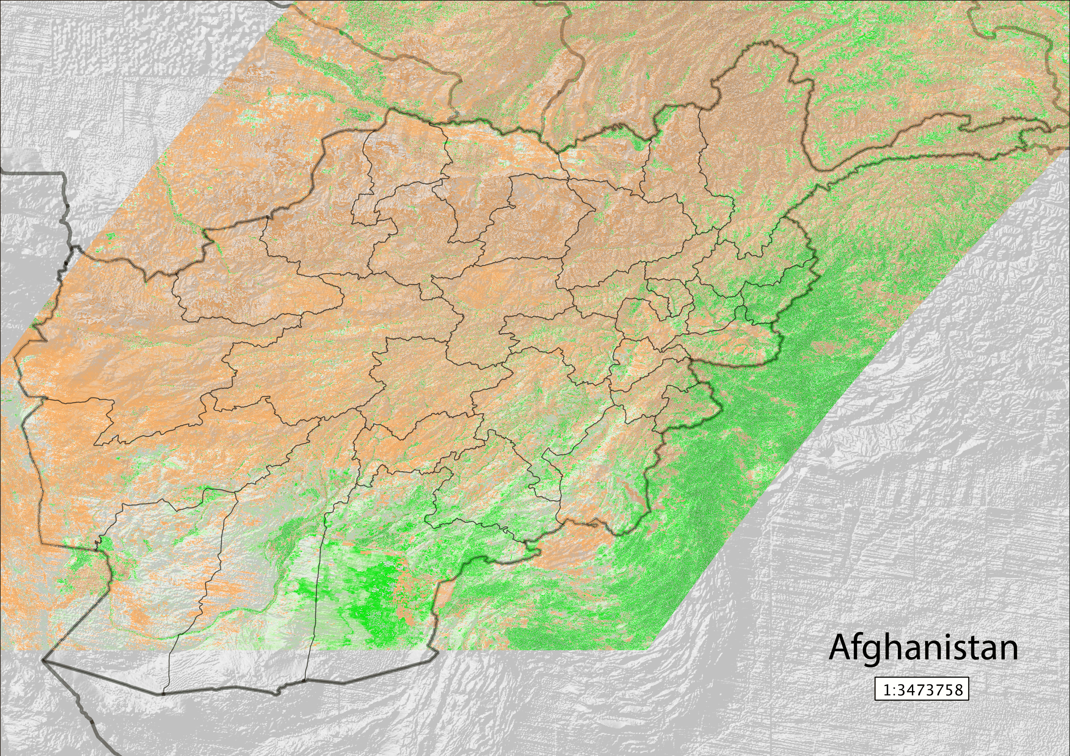
The brownish regions represent a negative anomaly (indicating a vegetation less healthy than the average) while the greenish regions a positive anomaly. Darker colours indicates a stronger anomaly in both directions. To put these colours into context I run the same analysis (with the same type of imagery) to photograph the exceptional drought that hit the United States in 2012. With the same colour scale as above here the result:
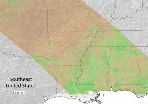
According to the NDVI values, the 2012 drought in the US was stronger than that in 2008 in Afghanistan.
Once prepared a raster with NDVI anomaly values, I had to try to quantify the population affected. To estimate it I decided to use the number of people living in the proximity in areas with significant negative NDVI anomalies. The first step was to decide what was a significant anomaly: I quantify it with a value of -200 or lower (that is, because the NDVI is expressed on scale from 0 to 10,000, a difference of -2% from the average). Arguably it is possible to fix the threshold at a lower level (like -10%) but it really depends on how much one considers the average of the considered years to represent a measure of a healthy vegetation.
3) The data for the population was downloaded from the HumanitarianResponse website which collects dataset from different sources. The website is run by the United Nations Office for the Coordination of Humanitarian Affairs (UNOCHA). The dataset I downloaded contained information (including location) on 17,075,000 people, 2,731,000 households, 37,767 villages. These figures are reasonably close to the last estimate of the Afghan government for the total rural population (about 19 million people. Unfortunately the source of the dataset is not indicated -possibly it is the Central Statistics Organisation of Afghanistan (CSO)- nor when the data was collected. Nevertheless I cross checked the dataset with population estimate for different provinces as published on the CSO website and they seem close enough. So let’s take it as a good approximation of reality in rural Afghanistan in 2008.
Now all the cards are on the table: we have figures and geographic locations for both population and NDVI anomaly. We need to intersect the data.
4) The data comes in two different format. Population is in a vector layer, that is, a table with each row representing one point on the map, while NDVI anomaly values comes in a raster layer with each pixel representing a square of 500m size. To understand which villages where at risk of drought in 2008 we need to calculate the mean anomaly for the area surrounding the village. We do this with QGIS using the “Buffer” tool: we will draw a circular polygon around each village with radius 5km (to be exact 0.05 degrees).
5) We are now ready to intersect the new polygons with the raster containing the anomaly. This time we use the “Zonal statistics” tool of QGIS, which will give us for each polygon the mean value of the pixels contained in the corresponding geographic region on the raster layer. In other words, we obtained the mean anomaly in the area surrounding each village.
6) The final step is to query the vector layer to identify the villages where the mean anomaly is less or equal to -200, our threshold level, and sum the population of each village. Because the table containing the statistics on villages is pretty big (37,000 rows and about 200 columns) we want to use a SQL-based database management system (I used the open source Postgres) to perform the following SQL queries:
- SELECT SUM(population) FROM vector_layer WHERE mean; <= -200; (for the sum of the population affected)
- SELECT (SELECT SUM(population) FROM vector_layer WHERE mean <= -200) / SUM(population) FROM vector_layer; (for the proportion of the population affected over the total population)
- SELECT t1.province, pop_risk, pop_tot, pop_risk/pop_tot AS percFROM(SELECT province, SUM(population) as pop_risk FROM vector_layer WHERE mean <= -200 GROUP BY province) AS t1JOIN(SELECT province, SUM(population) as pop_tot FROM vector_layer GROUP BY province) AS t2ON t1.province = t2.provinceORDER BY perc DESC; (for a table with total population affected as “pop_risk” and percentage as “perc” over the total population in affected provinces)
These the results:
- 4,407,538 people affected;
- 25.81% of the total rural population affected;
-
province pop_risk pop_tot perc Badakhshan 738,691 753,823 97.99% Baghlan 562,410 580,518 96.88% Samangan 235,570 260,066 90.58% Faryab 592,039 700,001 84.58% Sari Pul 341,378 409,019 83.46% Balkh 516,495 678,190 76.16% Jawzjan 225,552 309,529 72.87% Takhar 433,794 667,089 65.03% Kunduz 323,966 508,113 63.76% Panjsher 49,212 95,716 51.41% Badghis 177,413 499,523 35.52% Bamyan 47,711 329,084 14.50% Paktya 26,943 468,371 5.75% Khost 34,640 640,945 5.40% Hirat 69,908 1,293,924 5.40% Parwan 11,586 421,690 2.75% Maydan Wardak 9,513 509,320 1.87% Nimroz 817 92,747 0.88% Ghor 4,537 606,504 0.75% Paktika 5,363 794,594 0.67%
Finally, with the same queries, let’s try to lower the threshold to -1000, that is a -10% difference from the mean NDVI over the previous 8 years:
- 33,368 people affected;
- 0.2% of the total rural population affected;
-
province district pop_risk pop_tot perc Kunduz Kunduz 28,089 97,457 28.82% Badakhshan Khwahan 3660 14,263 25.66% Kunduz Khanabad 1572 99,222 15.84% Kunduz Chahar Dara 47 37,669 0.12%